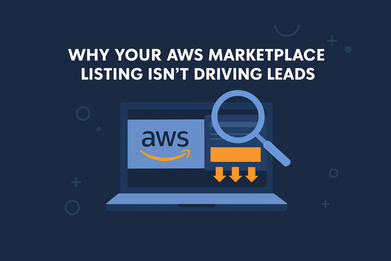
If your AWS listing feels invisible, this is the blog you’ve been waiting for.
Introduction
So you made it. You passed FTR, got listed on AWS Marketplace, maybe even shared it on LinkedIn.
But… no leads. No calls. No clicks.
Just silence.
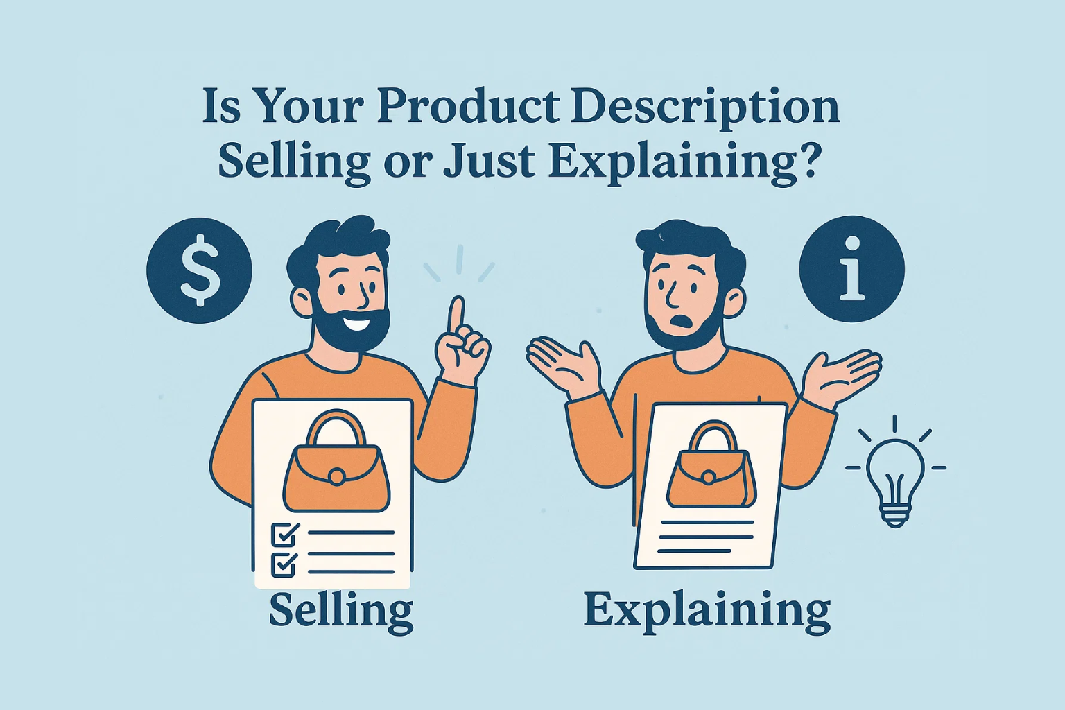
The truth? Most AWS Marketplace listings aren’t broken; they’re just not built to convert.
Let’s break down exactly why and how to fix yours with buyer-ready clarity.
Why Your Listing Isn’t Converting
| Problem | What It Means | How It Affects Buyers |
|---|---|---|
| Vague headline | “Cloud security solution” is too generic | Buyers can’t tell what problem you solve |
| No specific AWS services | You’re not aligned with AWS ecosystem | Sellers and reviewers ignore you |
| Weak architecture diagram (or none) | No proof of fit | CTOs don’t trust deployment claims |
| Missing use case or ICP | No clear value prop | Sales doesn’t know who it’s for |
| Too technical, not outcome-led | Focuses on features | Business buyers can’t justify it internally |
| No real call-to-action | Just “Subscribe” | No path to explore or talk to you |
If a buyer can’t understand your solution in 20 seconds, you’ve already lost them.
Think of Your Listing Like a Landing Page
Just like any conversion-driven page, your AWS listing should:
- Hook Attention – Clear headline + AWS alignment
- Build Trust – Diagrams, use cases, compliance signals
- Drive Action – Contact CTA, trial option, or explainer link
Quick Fixes You Can Apply Today
1. Rewrite the Headline for Clarity + AWS Relevance
Before: “End-to-end observability platform”
After: “Real-time Observability for Kubernetes Workloads on EKS”
2. Add a Use Case Block
Include 2–3 specific outcomes:
- Detect API fraud in real-time
- Slash deployment time by 70%
- Secure multi-tenant workloads at scale
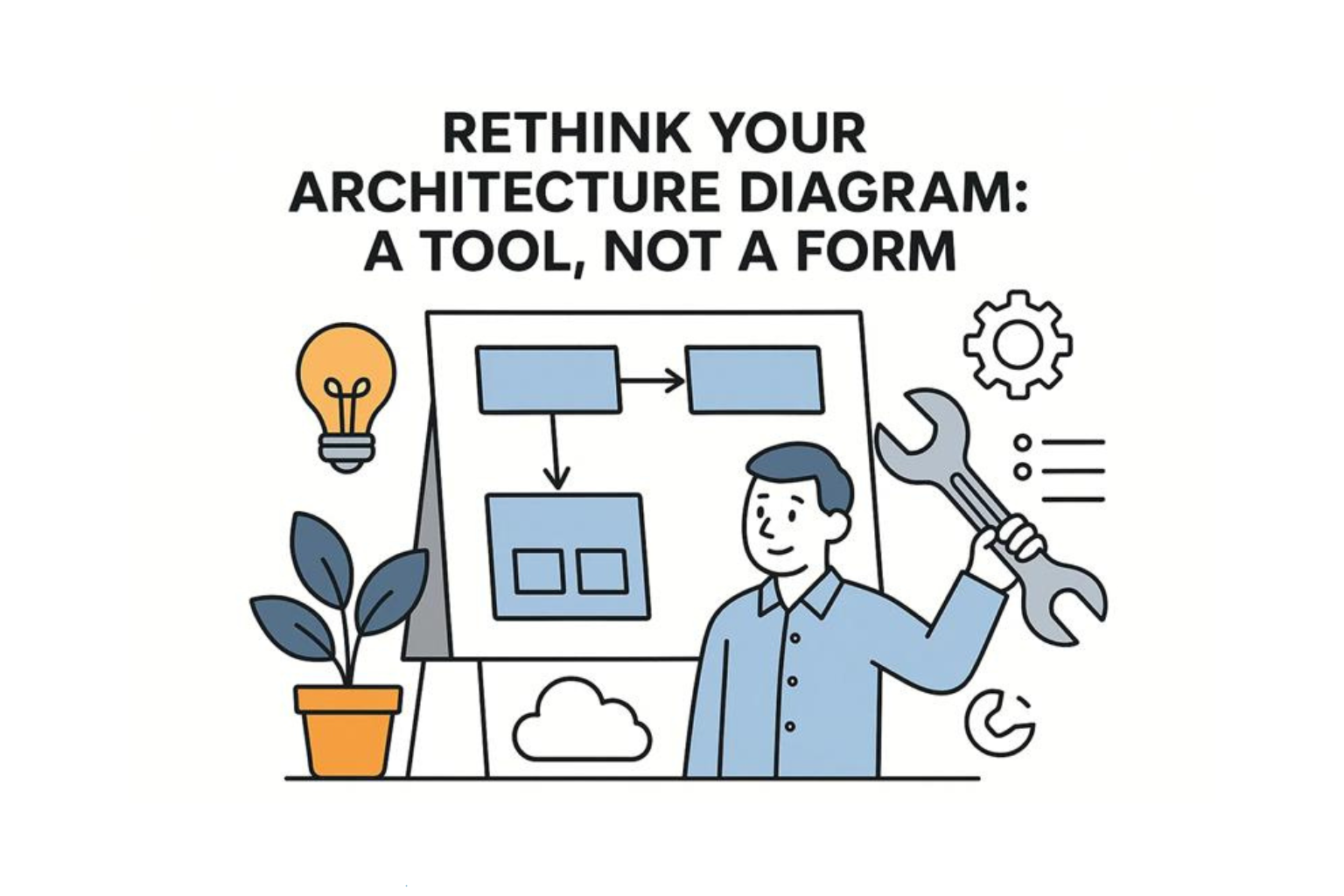
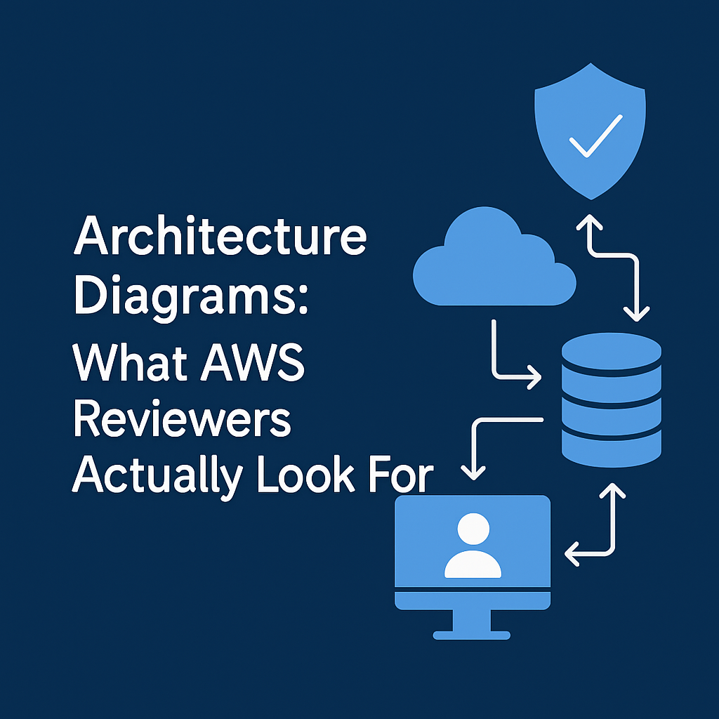
3. Insert a Deployment Diagram
- Use official AWS icons
- Label flows clearly
- Highlight scalability or compliance points
4. Include Buyer Personas
Add a section like:
“Ideal for:
• Cloud Security Architects
• DevOps teams managing EKS
• Fintech compliance managers”
5. Add a CTA That Doesn’t Say “Subscribe”
Instead try:
“Request a free deployment guide”
“Book a 20-min solution walkthrough”
“Try our CPPO sandbox environment”
Real-World Example: Before vs After
| Section | Before | After |
|---|---|---|
| Title | “Cloud data platform” | “Self-Hosted Snowflake Alternative for Analytics Teams on AWS” |
| Subheading | “Built for speed and scale” | “Deploy in under 15 minutes using CloudFormation, backed by S3, Glue, and Athena” |
| CTA | “Subscribe” | “Get Sample Use Case Guide” |
Result?
- 4x more profile views
- 2x more inquiries via private offers
- AWS sellers started recommending them in regional GTM chats
Conclusion
You don’t need a redesign.
You just need to treat your Marketplace listing like a sales page, not a formality.
Great tech doesn’t convert.
Great communication does.
Want us to optimize your listing for buyer conversion?
Contact us for more details.
