Your architecture diagram shouldn’t need a tour guide
Introduction
You know your architecture inside out. Your dev team lives it.
But what happens when a Partner Manager, GTM lead, or AWS Co-Sell rep looks at your diagram?
Usually, blank stares.
Because most technical diagrams are built for your team, not your partners.
And in AWS programs, that’s a problem.
In this post, we break down how to design technical diagrams that communicate with clarity, even to non-engineers. Whether you’re preparing for FTR, AWS Marketplace, or Co-Sell enablement, this is your visual secret weapon.
The Goal of Your Diagram: Clarity, Not Complexity
When AWS reviewers or partner managers open your content, your diagram should immediately answer:
“What does this product do, and how does it use AWS?”
That means:
- Not too many layers
- Not too many acronyms
- Not assuming deep technical knowledge
- Not leaving anything unlabeled
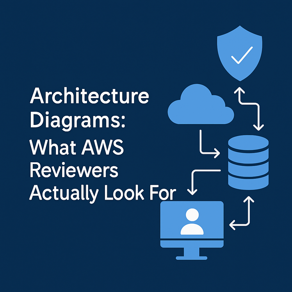
6 Key Elements of a Reviewer-Friendly Technical Diagram
| Element | What to Include |
|---|---|
| Labeled AWS Services | Use official AWS icons and names (e.g., Amazon RDS, not just “DB”) |
| Clear Data Flow Arrows | Show direction of requests, storage, and responses |
| User Entry Points | Label where end users or customers interact (e.g., UI, API Gateway) |
| Security Boundaries | Use boxes for VPCs, subnets, IAM scopes if relevant |
| Simplified Tiers | Present application, database, and infrastructure layers logically |
| Text Annotations | Use short callouts to explain what each component does, not just what it is |
Tip: Use colors sparingly—ideally grayscale with 1–2 accents for callouts.
Example Use Cases That Don’t Need Engineering Deep Dives
- A Partner Manager preparing to co-sell your product
- A Marketplace reviewer validating deployment structure
- A customer success lead onboarding a client
- An AWS Account Manager pitching your product internally
In every case, they need to understand how it works, quickly and visually.
Common Mistakes
- Icons without labels → “What’s this hexagon again?”
- No user flow → “Where does the user actually connect?”
- Unused services included just to look ‘cloudy’
- Marketing visuals (gradient-heavy PDFs, no directional flow)
- Too much abstraction (“Data Orchestration Layer” as a black box)
Tools That Work Well for This
- Lucidchart with AWS shape libraries
- draw.io / diagrams.net (clean and free)
- Whimsical (for early sketches)
- Excalidraw if you want a hand-drawn vibe for lightweight onboarding
Pro Tip: Create two versions of your diagram:
- One for AWS reviewers (detailed)
- One for sales decks and partner enablement (simplified with business benefits)
Conclusion
Your technical diagram shouldn’t need an explainer call.
If a non-technical reviewer can look at it and say,
“Ah, I get how this works and why it matters on AWS,”
Then it’s doing its job.
Because the best diagrams don’t impress, they clarify.
Want help redesigning your AWS architecture diagram for Co-Sell, FTR, or Marketplace?
Contact us for more details

